

Only semi-beautiful, but I tried
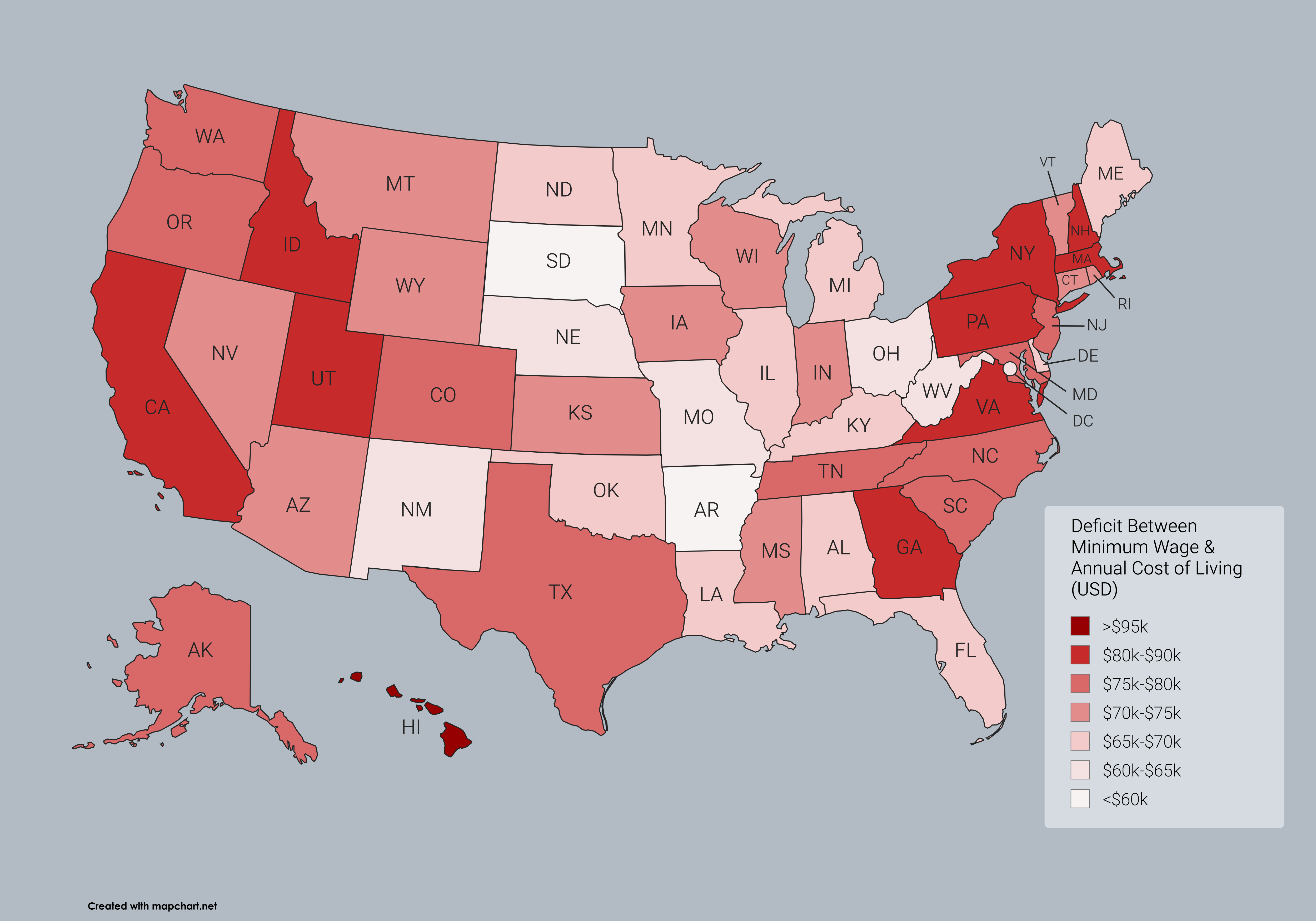
Annual cost of living data according to SmartAsset 2025 Report, except for DC which is not included in their reporting.
DC annual cost of living was estimated to be $99,424 per separate data, however it may be outdated. This would place DC as less expensive than 18 states by 2025 numbers, which is probably lower than it should be.
Minimum wage income assumes 40 hours per week by 52 weeks a year at the minimum wage rate.
This is interesting because it not just a population map.
Thank you! I wanted to make it for my own visualization after seeing the SmartAsset report.
Often people focus on raw cost of living, which would look like a very different map outside of the extreme ends of the scales. Considering the deficit between the lowest paid work and the cost of living I think gives a bit more insight. I think the minimum floor always exists as a threat to higher paid labor in the sense that if skilled professionals, like nurses, ask/strike for better pay then the response usually starts from “if you dont like nursing for $X/hour, then go flip burgers for $Y/hour”
Even if few people actually earn at the minimum wage, the fact that many states still cap at the federal $7.25 means the bar is quite low in those states for all work paid above minimum as well.
Of course the primary visual that is easy to glean from the map is a scale of how fucked people are the closer they are to the bottom of wage earners in their state. Even though Georgia and Louisiana both cap at federal minimum, it would be easier to survive as a low wage earner in LA. Or conversely, DC might be in the top 20 expensive places to live, but they have a higher minimum wage than any state by far ($17.50), so it is truly more affordable to survive in than many states that have a far lower cost of living