I dont have a mac or an iphone, but actually follow tech, so Im at least aware of what apps exist… if I had to guess the rest:
calendar, contact book, video call, time machine backups (this one probably requires knowing that backups are a thing), some sort of e-reader, music app, launcher (macOS did the thing where they added an iOS type launcher when they started making “fullscreen” its own special thing right?), and given the final one is a stamp so… apple mail?
So unless I’m wrong, and we say safari, app store, time machine, and the launcher aren’t clear. that’s still 6/10 icons that ARE clear. Even if we take out the reader… 5/10… it’s still mostly recognizable
Compared to the FOSS side, which gets GIMP. 1/10.
and I agree there assumptions being made. Things like “App store” needs an A because English is not very inclusive, but I dont think that makes things soulless. If their assumptions were “we’re making luxury items for affluent Americans (who generally speak English)” then they made a fine decision for reaching their target audience. I’d argue that the app store icon has the most “creativity” put into it.

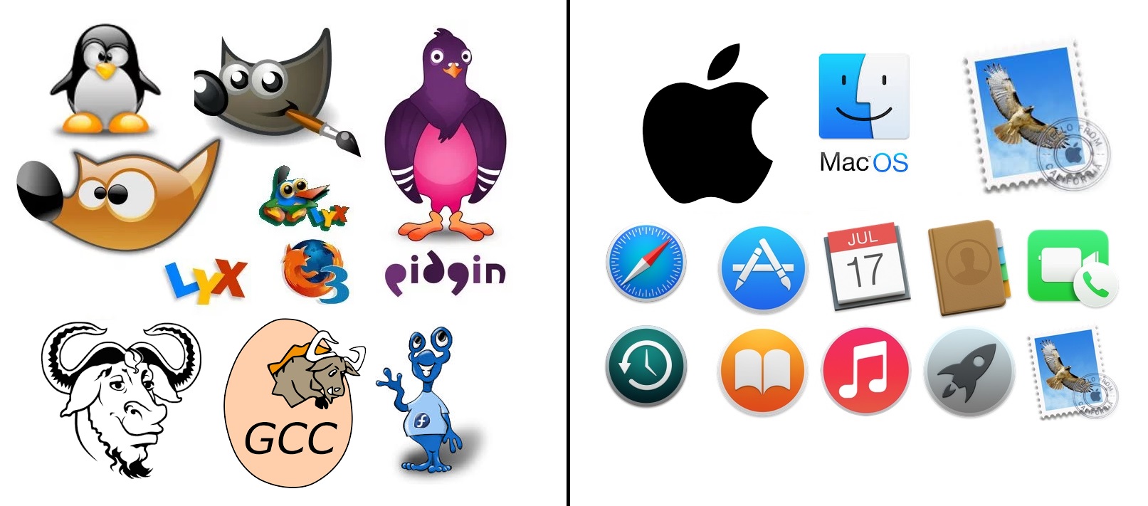
safari, and the app store aren’t great.
I dont have a mac or an iphone, but actually follow tech, so Im at least aware of what apps exist… if I had to guess the rest:
calendar, contact book, video call, time machine backups (this one probably requires knowing that backups are a thing), some sort of e-reader, music app, launcher (macOS did the thing where they added an iOS type launcher when they started making “fullscreen” its own special thing right?), and given the final one is a stamp so… apple mail?
So unless I’m wrong, and we say safari, app store, time machine, and the launcher aren’t clear. that’s still 6/10 icons that ARE clear. Even if we take out the reader… 5/10… it’s still mostly recognizable
Compared to the FOSS side, which gets GIMP. 1/10.
and I agree there assumptions being made. Things like “App store” needs an A because English is not very inclusive, but I dont think that makes things soulless. If their assumptions were “we’re making luxury items for affluent Americans (who generally speak English)” then they made a fine decision for reaching their target audience. I’d argue that the app store icon has the most “creativity” put into it.