
Example: Warner Bros’ logo looks like a shield which makes me think about medieval times.
The catholic church uses a cross, which could be understood as a reference back to when, according to their beliefs, Jesus christ died on a cross to relieve Christians of their sins, which would’ve been almost 2000 years ago by now. That’s quite a throwback if you ask me.
You might be touching on skeuomorphs, when a modern object reflects the design of its outdated version. A modern phone that looks like a rotary phone. An LED light fixture that looks like a gas lamp. The save icon resembles a floppy disk even when saving to a solid state drive.
Not quite a logo but a symbol, but symbolically rotary phones and floppy discs have become the symbols of calling and saving respectively. There are plenty of other symbols that also draw their symbolism from obselete things.
I wonder how many people do photo editing while being blissfully unaware of why the tools are named the way they are.
What, like the brush? P This sounds quite interesting, so please explain.
Pretty much all the basic tools are named after and have icons looking like the original, physical tools used back in the analog days of photography, and also painting and printing in general.
Brush, pen and scissors being the obvious ones, masking should also be fairly self-explanatory. But then there’s also stuff like dodging and burning, which is a technique used in the darkroom to increase or decrease exposure of specific parts of the physical image, and a lot more I have to look up the english names for first
HMV for obvious reasons.
Both BMW and Alfa Romeo have logos that originate in heraldry.
Cisco - the golden gate bridge was built in the 1930s
Disney - a castle
Starbucks - a mythical figure
BMW isn’t heraldry, though? It’s a stylized aircraft propeller, because they first made airplane engines. Am I wrong?
The alternating blue and white are derived from the arms of the free state of Bavaria. The exact pattern is adapted partly because it was illegal to use it directly but ultimately from there. More details on the Wikipedia page, as always. The propellers idea only came about as a result of an ad campaign later.
Very cool, thank you!
Not sure if it fits what you’re after but the stories behind a lot of football (soccer) team badges can be quite interesting.
For instance, my own team, Dunfermline Athletic - here’s our badge:
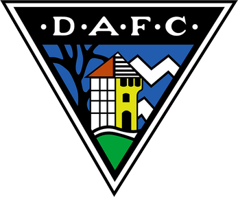
The building represents Malcolm Canmore’s tower (a local historical site) the curvy line represents a small river or burn running through the town, and the green area at the bottom represents Pittencrief Park, a large public park gifted to the town by Andrew Carnegie (who was born in Dunfermline).
It can also be interpreted as a visual representation of the meaning of the town’s name itself - from Wikipedia:
There have been various interpretations of the name, “Dunfermline”. The first element, “dun” translated from Gaelic, has been accepted as a (fortified) hill, and is assumed to be referring to the rocky outcrop at the site of Malcolm Canmore’s Tower in Pittencrieff Glen (now Pittencrieff Park). The rest of the name is problematic. The second element, the “ferm” may have been an alternative name for the Tower Burn according to a medieval record published in 1455 which, together with the Lyne Burn to the south, suggests the site of a fortification between these two watercourses.
A lot of club badges will have similar historical references if that’s your thing :-)